When you first start out implementing Statistical Process Control (SPC), it is unlikely that your company will invest in a powerful software package. Most likely you will start out using paper and pencil method or Excel, because there is no external payments required to get started (labor only).
You can manually create columns in Excel to calculate the control limits for your chart, since Excel can quickly provide a line chart. To help you avoid creating the control limits and chart yourself, you can download a simple Excel file of an Individual Control Chart for free >>>
One of the biggest limitations to using Excel is the ability to identify out of control points. I don't have any great solutions for this unfortunately. This is why a software package like SigmaXL is ideal, which is an inexpensive Excel add-in (under $300). The work around to this limitation is to train your employees on the Western Electric or Nelson rules, and provide a handouts for them to reference (somewhere near the location of the control charts for quick access). Even with lots of training, out of control conditions will be missed or incorrectly identified.
The next limitation is the ability to mark the out of control condition with a comment about the assignable cause or corrective action (also known as OCAP or out of control action plan). Until recently, I would make a comment in Excel by inserting a text box into the chart. However, as you add more data points to your chart, the text comment does not move with the out of control point. You have to manually move it, which is a pain, and probably won't be properly maintained.
There is a solution to this problem!
First, we need to isolate the data point you want to assign the comment. Click on the data point in the Excel chart, which will highlight all the chart data points.
Next, click on the same data point a second time, to isolate only that data point. Otherwise, the changes will be applied to all points (which we don't want).
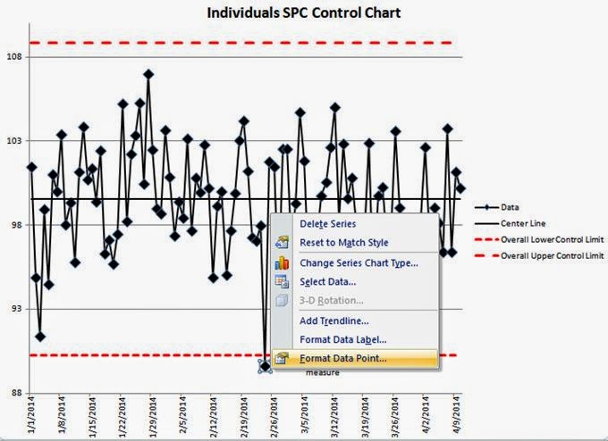
Next, right click on the isolated data point. You should see the following menus appear.
Next, select the "Add Data Label" command.
This will assign the actual data value to your data point. Click on the data value to edit the value, and write in your comment.
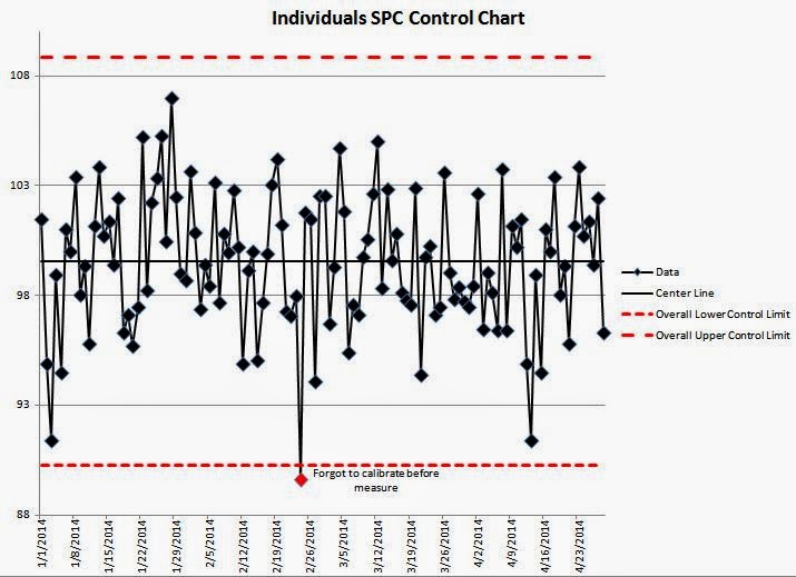
We entered "Forgot to calibrate before measure" as the new data label. This will keep your comment aligned with your data point, even when new data points are added. In the chart below, we have added 20 more data points, but the comment stays connected with the out of control point. Problem solved!
You can manually create columns in Excel to calculate the control limits for your chart, since Excel can quickly provide a line chart. To help you avoid creating the control limits and chart yourself, you can download a simple Excel file of an Individual Control Chart for free >>>
One of the biggest limitations to using Excel is the ability to identify out of control points. I don't have any great solutions for this unfortunately. This is why a software package like SigmaXL is ideal, which is an inexpensive Excel add-in (under $300). The work around to this limitation is to train your employees on the Western Electric or Nelson rules, and provide a handouts for them to reference (somewhere near the location of the control charts for quick access). Even with lots of training, out of control conditions will be missed or incorrectly identified.
The next limitation is the ability to mark the out of control condition with a comment about the assignable cause or corrective action (also known as OCAP or out of control action plan). Until recently, I would make a comment in Excel by inserting a text box into the chart. However, as you add more data points to your chart, the text comment does not move with the out of control point. You have to manually move it, which is a pain, and probably won't be properly maintained.
There is a solution to this problem!
First, we need to isolate the data point you want to assign the comment. Click on the data point in the Excel chart, which will highlight all the chart data points.
Next, click on the same data point a second time, to isolate only that data point. Otherwise, the changes will be applied to all points (which we don't want).
Next, right click on the isolated data point. You should see the following menus appear.
Next, select the "Add Data Label" command.
This will assign the actual data value to your data point. Click on the data value to edit the value, and write in your comment.
I would also recommend changing the data point color of the out of control condition (as shown above), so it stands out, and you can show others that it was identified.
Simply right click on the isolated data point (make sure it is the only point highlighted).
Next, select "Format Data Point..." then click on the "Marker Fill" section
Select "Solid Fill" and then select the color of the data point. Red is a commonly used color for out of control points.
As a reminder, here is the link to this free simple Individuals control chart template for download >>>
If you would like to train your employees on Statistical Process Control (SPC) Charts, purchase our training Powerpoint template >>>
Have you found any other tips for control charts in Excel?


